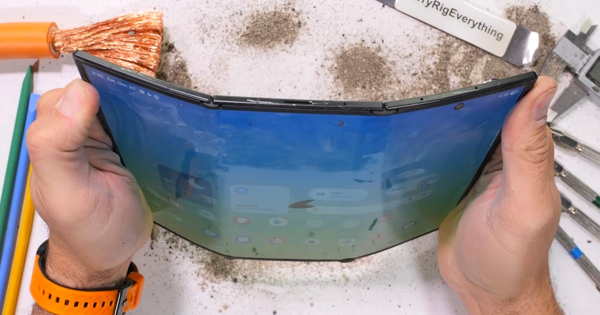
The At a Glance widget on Google Pixel phones has been the bane of my existence for far too long. Not that it’s terrible, but so far there’s been no way to remove it and there seems to be little reason to use it.
Android Authority discovered that in the latest Canary (beta) version of Google’s Pixel launcher, there’s a new option in the at-a-glance settings menu that says “Show on Home Screen,” suggesting you’ll finally be able to disable the persistent widget. The post says that so far the switch doesn’t even work, but hopefully you’ll finally be able to turn it off by the end of 2025.
At a glance it could be amazing, but in practice it only shows the date and weather, making it incredibly boring. Google even tried to remedy this a few years ago when it launched Material You along with a series of fun and exciting widget designs. However, At a Glance often blocked attempts to use them on the main home screen and often displayed the same information, making the fun widgets sadly redundant. You might think that a smart widget like At a Glance would adapt to the other widgets on your screen, but it doesn’t, so overlapping information is often inevitable.
![]()
Honestly, it shows a lot of Google’s flaws in one small widget. It’s an outdated design that most would think the company has forgotten. Not so, as Google has been quietly adding more capabilities over the years. However, at the end of the day, not having the option to disable it and replace it with another widget undermines Google’s customizable, human-centered design ethos.
The other thing that drives me crazy is that it will adapt to show new information beyond the date and weather, but then hide that new information behind a slide to a semi-hidden second page. I would say that if you have something new to say, you should show it right away. The date and weather are there 90 percent of the time, so anyone who’s looked at their phone once has probably seen them within the last hour. Please show me the other information more often!!! If not, adapting the widget every time I look at my phone seems pretty pointless.
To make things even more frustrating, it can also simply display something like a calendar event on that second hidden page, which usually appears as a notification or some other type of alert, so that when I see it in At a Glance, I’ve already seen it on my lock screen or in my notification shade. The same goes for extreme weather alerts.
The pink settings are for the old At a Glance and the white ones are for the new design.
Material You was introduced in 2021, and a newly designed At a Glance widget followed in subsequent years. It looks great and matches the style of modern Pixel phones perfectly. However, I’d venture to guess that no Pixel owners are using it, since then they’d have to deal with two widgets at a glance on their home screen. However, to round it all out in a way that almost makes no sense, the more attractive At a Glance widget lacks as many capabilities as the text-based original, but seems to display alerts for things like your calendar more effectively. At the end of the day, it seems crazy to me that Google has a better version of this widget, but you can’t use it.
Overall, it highlights how Google’s attention to detail can falter over time, as internal teams often tend to overlook their own projects. Seriously, I have no idea how the second widget was approved and shipped at a glance, knowing that it can’t replace the regular version without using a third-party launcher. Hopefully Google is finally on its way to remedying this as people have only been complaining about this since 2019.
Fountain: Android Authority
MobileSyrup may earn a commission from purchases made through our links, which helps fund the journalism we provide free on our website. These links do not influence our editorial content. Support us here.
#Google #Remove #Outdated #AtaGlance #Widget #Pixel #Phones